


Sweet Truth
Brand refresh for Sweet Truth, a dessert brand by Rebel Foods.
Launched in 2018 by Rebel Foods (the parent brand of Faasos), Sweet Truth began with the tagline “Undo Bitterness”. Over time, the brand has evolved from being a comfort-driven indulgence during the pandemic to becoming a part of everyday celebrations. Now present in over 70 cities and 400+ locations across India, Sweet Truth needed a refreshed identity—one that reflects its belief in making life sweeter, one dessert at a time.
Brief
To reimagine Sweet Truth’s identity in a way that brings together its core ethos: celebration, connection, and indulgence. While standing out in a crowded, pastel-heavy dessert space.
Challenge
The category is saturated with visual languages borrowed from European patisseries—soft hues, dainty type, and generic motifs. Sweet Truth needed to break free from the visual clichés, shed its underdeveloped identity, and emerge as a vibrant, emotionally resonant dessert brand for the Indian market.

Our Approach
We articulated a clear mission for the brand: To deliver desserts that make every celebration sweeter, whether a milestone or a midweek mood-lift. This positioning balances indulgence with emotional resonance, allowing the brand to hold space across personal, shared, casual, and festive moments.
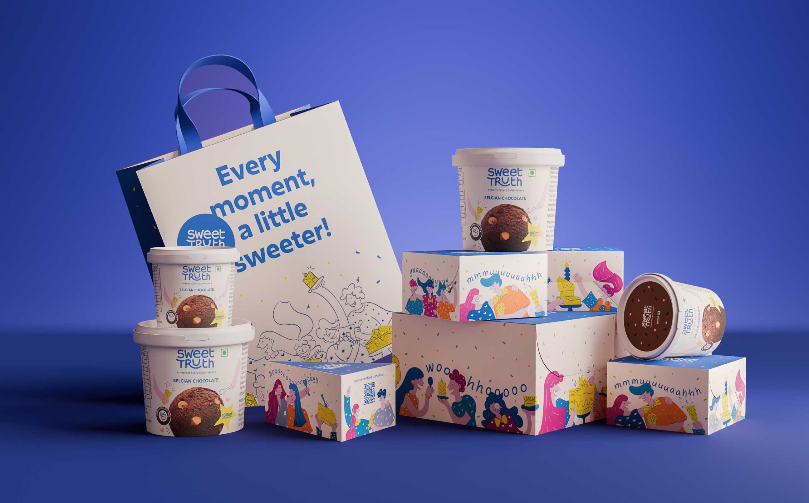
Logo
The refreshed logo features custom lettering that evokes joy, warmth, and softness. Playful curves and a looping tail on the “R” create a sense of movement and invitation. Framed by twin heart symbols and centered with the tagline, the mark becomes a seal of celebration—unmistakably Sweet Truth.


Illustration System
Celebration takes centre stage in our illustration-first approach. The side panels of our dessert boxes come alive with vignettes: a person savouring cake solo, a couple sharing a bite, a lively gathering around a table. These moments are relatable, layered, and culturally resonant, serving as visual metaphors for the brand’s purpose. Illustrations aren’t just decorative—they’re narrative. They make Sweet Truth recognisable from afar while creating moments of emotional connection up close.


